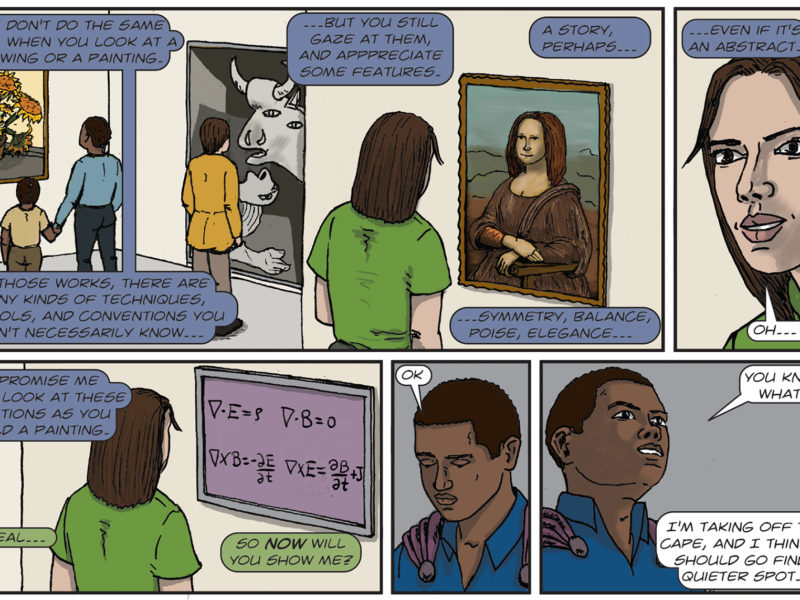
It may come as a surprise to many of us but there are people who read and research comic books for a living. While they may not have a PhD in comic books, studying comic books is a diverse field, and incorporates disciplines from sociology, media, and the visual arts. A few years ago, PhD Comics covered the Comics Arts Conference, an annual academic conference held in conjunction with ComicCon International and WonderCon, in a YouTube video. I became interested and contacted one of the academics in the video, Keegan Lannon, a then PhD candidate from Aberystwyth University in Wales.
Keegan's work focuses on how stories are told within comic books, or its narrative. As you read the words on a page in a book, your mind creates an image as your eyes scan across the page. Keegan is not only interested in what mental processes take place, but also what the information conveyed says about a people and a culture.
In the PhD Comics interview, Keegan mentioned that the "more abstract a comic, the more they can relate to it." I found this statement interesting because, as many comic fans know, there is a range of visual styles that artists use to tell a story, and I asked him about what this means. He explained that people can better relate to abstract images than more realistic images, an idea he first encountered in Scott McCloud's Understanding Comics. Keegan says:
“This idea is really a question of immersion: abstract images allow the reader to more easily enter into the story. This idea stems from how the mind processes images compared to how the mind imagines the self. When we look at other things, we can see the detail of that thing. For example, when you look at a person, you can see what color her eyes are, how long and textured her hair, etc. However, when we picture ourselves, we imagine an abstract collection of features. When I think of myself, I imagine the glasses I wear, the general shape of my head (which I often imagine wrong), and an approximation of my hair style (which, again is wrong). When a comic image shows a lot of realism and detail, the reader feels as if he or she is looking at the thing itself. A more abstracted or simplified image is more akin to what one "sees" of oneself. So really, more simplified images allows one to "see" oneself in the comic.”
We both speculated that there could be some attachment to how memory functions and our ability to relate to abstract images. We often think of the brain as a perfect storage device when, in fact, it is far from it. When we create a memory, our brains do not save everything in exact detail but rather save the broadest brush strokes. When we recall a memory, we fill in the details as needed. You may remember that the person you had a crush on when you were a child had blonde hair but you may not exactly recall what that hair felt like or how it flowed.
This means our memories are always a little spotty, so we tend to remember a more simplified or abstract image. Whether this is true or not, we can not say for certain as more research needs to be done. So this raises the question, has anyone done studies on the brains as people read comics? More importantly, though I did not ask this, how do I take part in this study? I mean, who would not want to be put into a fMRI or hooked up to an EEG and read comics while someone records data on your brain?
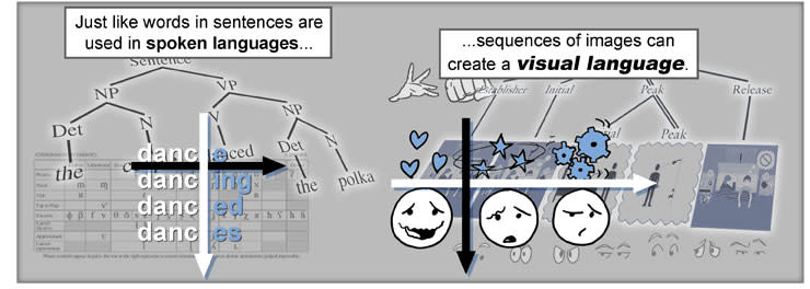
While Keegan's work is theoretical (or, as he puts it, literary), one scientist, Neil Cohn, has done research in this area, which can be seen in the Visual Language Lab home page. In his work, Cohn monitors the electromagnetic reactions of the brain exposed to images. Cohn models his experiments after a classic test that shows the position of words in a sentence improves understanding and communication, except with images.
In the classical experiment, words are flashed on a screen and, depending on word order, a certain curve in brain activity can be mapped. There is a very specific curve associated with "understanding." Cohn's experiment works in a similar way. Instead, he flashes comic panels in certain orders and is able to get certain curves when panels are put in the "correct" order.
While Keegan notes that the research is interesting in noting that the brain reacts in certain ways to different tranistions, he is not certain whether he agrees with Cohn's methods or conclusions. Keegan says:
“For one, no one reads panels in isolation. Having a single panel flashed on a screen is not really a model of reading which anyone follows. There are some people who monitor the eye when one reads, and the left-to-right-top-to-bottom reading paradigm is not exactly how the eye works. Instead, it flicks across the page at a very high frequency. Glyn White's Reading the Graphic Surface writes more about this. Secondly, the idea of "understanding" is very subjective. To suggest that one curve represents an understood meaning and one curve represents an inability to understand seems to suggest that only one possible meaning is available to the reader. In actuality, when two things are put into a sequence, the reader will create meaning from the images. It will be a different meaning than the "correctly" ordered panels, but it is still a meaning. I don't think the different curves suggest successful understandings, but rather different understandings.”
This raised an interesting point. I had remembered when Todd McFarland came out with Spawn and in an interview he mentioned that he could take the pages he drew for any issue, toss them in the air, pick them up at randon, and the story would still make sense; something I found odd at the time. Keegan explained there is a whole section of literary theory devoted to what McFarland said: the order of the narrative pieces are not important.
“George Landow and others have done research into what is known as hypertext fiction. It's in the same vein as Choose Your Own Adventure novels, but the premise is based on the idea that order is a construct of the thing itself, and that with a different order different narratives emerge. ...the flow of time is going to be grafted on to whatever the reader has in his hands.”
There are several examples of this as Keegan notes. B.S. Johnson's The Unfortunates is an experimental "book in a box" published in 1969. The book tells the story of an on-assignment sports writer, in a city identified by landmarks as Nottingham, who confronts ghosts from his past. As he attempts to report a football match, memories of his friend, a tragic victim of cancer, haunt his mind.
This "book" is made up of 27 unbound sections with only the first and last chapters specified. The 25 sections in-between range from a single paragraph to 12 pages in length, and are designed to be read in any order; the path through the novel is the reader's own.
This is not the only example that Keegan notes. J.M. Coetzee's Diary of a Bad Year, published in 2007, has three parallel narratives running across the page in three more-or-less equal sections. The reader can choose which parts to read, where to stop, and so on. Then there is Mark Z. Danielewski's Only Revolutions, published in 2006, printed in two equal and opposite facing parts. No matter how you hold and open the book, you can enter the narrative at a certain place.
This certainly made things far more complex and interesting than I ever imagined. Keegan admits that reading order and narrative order is tricky and he finds that the order in which the book is read tends to dictate the specific narrative the reader gets. He says:
“Each new reading gets a slightly different narrative, though the core narrative aspects (what happens, the characters, etc.) remain unchanged. It's sort of like asking 20 different people who witnessed a series of events what has happened; you'll get twenty or so different remembrances.”
Given how complex narrative form is, and that art is tied to the narrative in comics, this raised the question: how exactly does narrative differ across cultures?
“Interestingly, the comic is not a new art form, despite its recent rise in academic popularity. Depending on who you talk to, you get a different genesis: McCloud and Eisner like to trace the form back to hieroglyphics, the Bayeux Tapestry and other pictorial narratives from the early history of mankind; Americans like to think that comics started either in the newspapers around the beginning of the 20th century or with Superman in 1938; people familiar with art history will discuss Hogarth (1730s and onward) and his gigantic panels which were meant to be read in sequence as an early form of comics; and so on. Generally speaking, though, it is most widely agreed that the first modern comic, that is, a work that uses the conventions currently used in the contemporary versions of the medium, would be Rodolphe Töpffer's Histoire de M. Vieux Bois published in Europe in 1837 and America in 1942.”
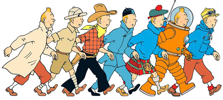
Comics have an appeal that Keegan says could be described as universal. With one exception, comics do not tend to differ too greatly from country to country. Every culture loves a good adventure story and Keegan says Tin-Tin is a good example of this.
The one exception is the superhero comic, as this seems to be an almost exclusively American phenomenon. This is not to say there have not been writers and artists from other countries; there was the British invasion in the 1980s and 1990s when comics by Alan Moore, Neil Gaiman, Mark Miller, Grant Morrison, and others flooded the superhero market. Despite this, Keegan goes on to say that superhero comics have never been as popular in other countries as they have been in America.
“Something about American's seems to gravitate towards narratives of fantasy and escapism.”
This is something I can agree with and something I have discovered in my personal research. A lot of this has to do with America's cultural background. Maybe this could be the topic of a future article.
Unfortunately, Keegan explains, "...the influx of cheap, sometimes trashy pulp comics in the first half of the 20th century gave the medium a sheen of juvenilia which, in America, it is still trying to shake. France has long had an academic appreciation for comics, published long, technical works on the form since the early 1960s."
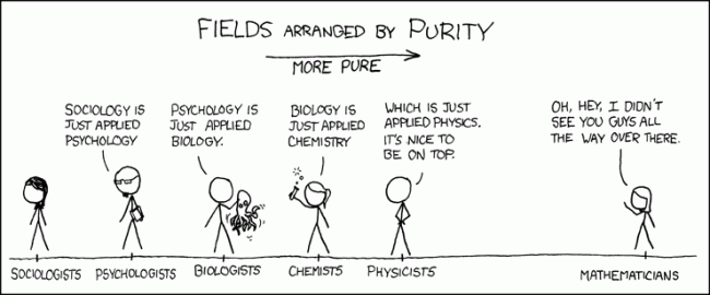
The visual language of Randall Munroe's XKCD abstract form contrasts to the hyperrealism seen in superhero comics (Credit: XKCD)
This is somewhat tragic to me. The stories told in comics have changed since the days of pulp, and many of the stories today are as complex and compelling as any work of classic fiction. It is a shame the general public does not recognize this. I would argue there are some graphic novels that should be taught in schools, the complexity of Marvel's Civil War comes to mind.
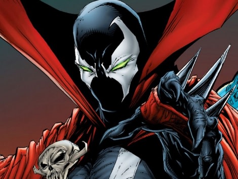
There is a spectrum of effects that can be generated by using abstract or realistic images. Take Randall Munroe's XKCD as an example on the far end of the abstract spectrum. Comics like XKCD allows the reader to easily slip into the narrative by reducing the narrativeIn his "webcomic of romance, sarcasm, math, and language," Munroe uses extremely simplified art (stick figures, vacant faces, etc.) to great effect. This differs from the hyperrealism of superhero comics with the exaggerated anatmies and depth of details. In many cases, as Keegan notes, there are, at times, too many details in musculature, creating an impossible image. Keegan says that:
“Comics like XKCD allows the reader to easily slip into the narrative by reducing the narrative to constituent parts, focusing more on the activity than the people.It's easy to imagine that same activity happening to you. Superhero narratives, on the other hand, allow the reader to imagine himself as someone else. This type of escapism is created by providing a very realized world, and allowing the reader to see all parts of it. This is less personally immersive and instead fosters escapism.”
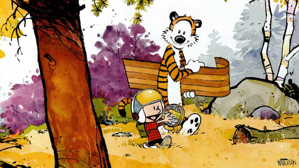
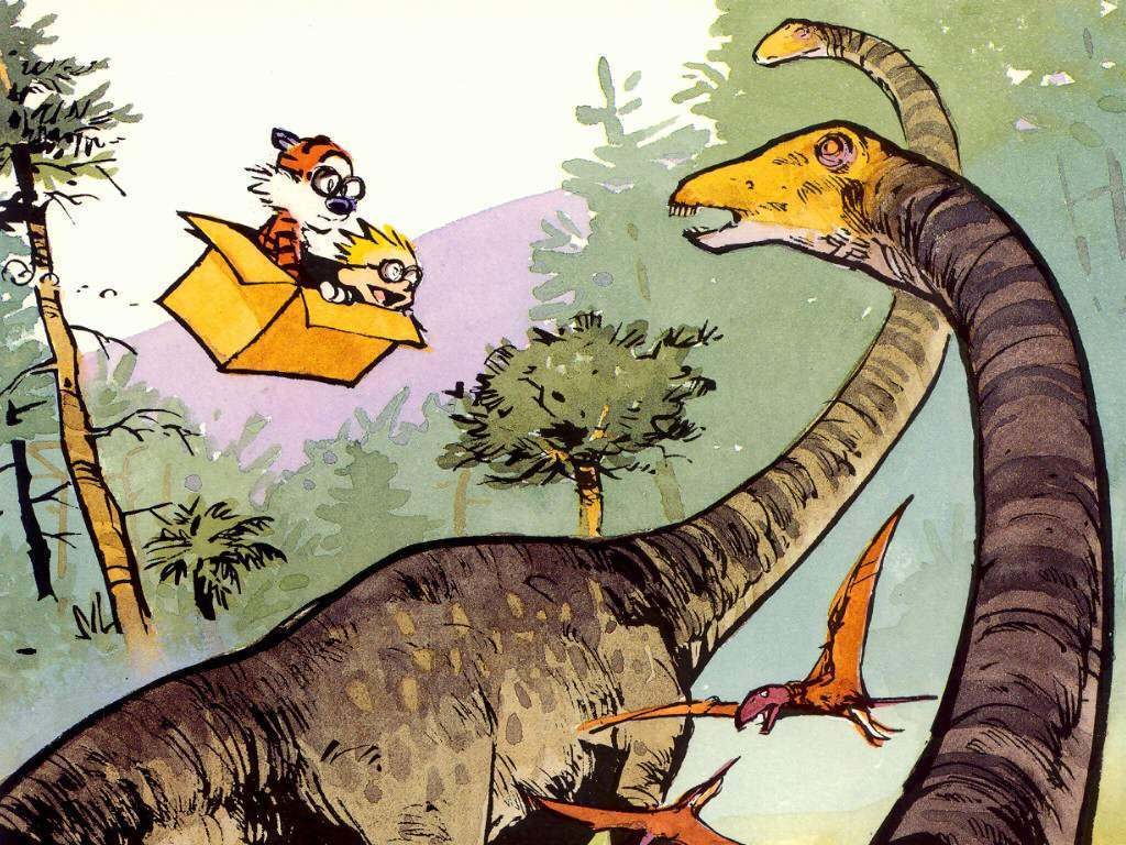
Lying inbetween are comics like Tin-Tin and Calvin and Hobbes. Both use very realistic background images, and a lot of detail, but the characters themselves are reduced to simplified shapes. Keegan mentions:
“This creates an immersive, escapist narrative in which the reader imagines himself as Calvin traipsing about with Hobbes, but not through the reader's own world, but this highly detailed, monster ridden world created by Bill Watterson.”
You have to admit there is something deeply profound about Watterson's comic strip, so profound that the Wall Street Journal has named it America's most profound strip (and with good reason).
“The type of narrative which the author and artist want to convey will then drive the art style: XKCD wants to touch on universal truths, Superman wants to transport the reader, and Calvin and Hobbes wants to immerse the reader in a potential childhood he may not have had.”
This is something to think about. Like a comic, a film reel is told through a series of still images. The action we perceive, either through reading or watching either medium, is an illusion. Artists and film makers have various tools at their disposal to draw us into these worlds they have created. The story told is as much theirs as it is ours. Now go read a comic and get lost in a fantastic world of your own creation.

